DON'T MAKE THAT LIGHTING MISTAKE
Light plays a significant role in our lives. When the sun goes up and indicates that our day is about to begin till the time it goes down and we wind down ourselves. Whether it be at home, in school or at the office, or maybe when we visit restaurants, museums and other public places, light affects our mood, our ability to concentrate, to relax or simply to have a good time. Perhaps we may not notice this as it is part of our daily lives. It is about time that we make lighting our priority. Proper lighting after all is key.
When I started building my home way before I was an interior designer, I knew only a few things about light thereby causing me to make mistakes. Yes, most of them involved decorative decisions, and some were functional ones.
Mistake #1 Color of light
I grew up in a home with white artificial light. Yes, it is what you call daylight. For all the areas in my home, this was a standard thing. Later on, we did have some warm white lights but somehow it seemed too dim for our usual purposes so my mom simply changed it back to the regular daylight. At the time, I didn't know that I needed to compute for the lumens (Wikipedia: SI derived unit of luminous flux, a measure of the total quantity of visible light emitted by a source) of the light which will enable me to know the proper illumination needed for a space. Looking back now I realize that the proper wattage and the distance of the lights from each other would mean better lighting.
As much as I do love daylight, if you like to set the proper mood, then consider other colors of light.

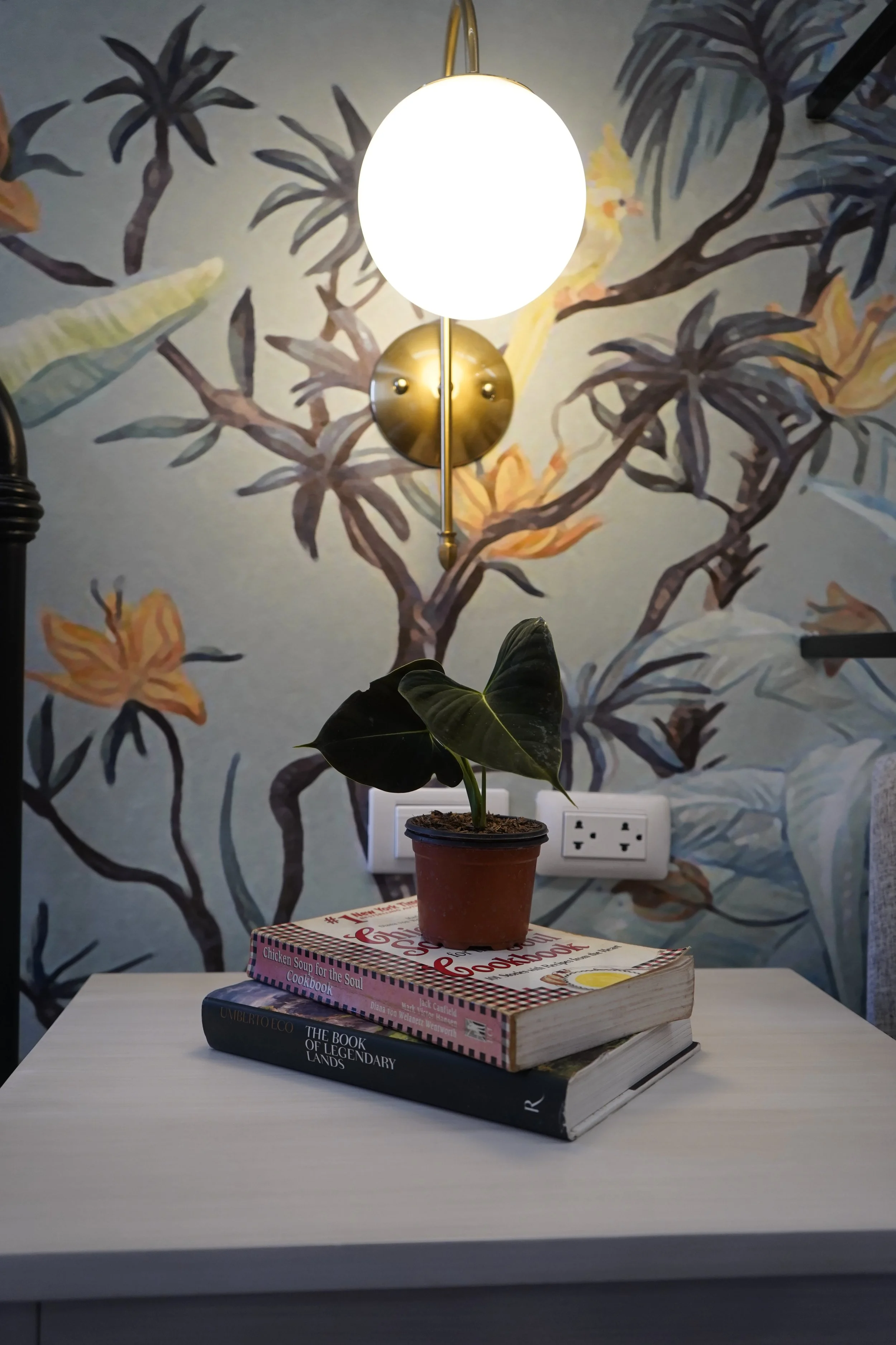
Warm white lighting
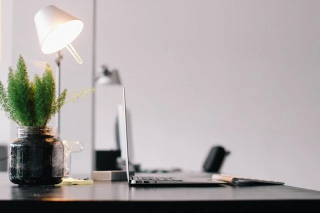
First and foremost, function should be given priority. For task lighting, a bright white mimics daylight (measured at 5000 to 6500 Kelvin) and makes for more productivity. That is why fluorescent lights in daylight are a staple for reading and other detail-oriented work. Daylight is also used for the dresser or where you put on makeup to ensure proper color rendering. Warm white is more inviting, relaxing and ideal for areas like the living and dining rooms where you want a warm, cozy glow.
Mistake #2 : Room Color
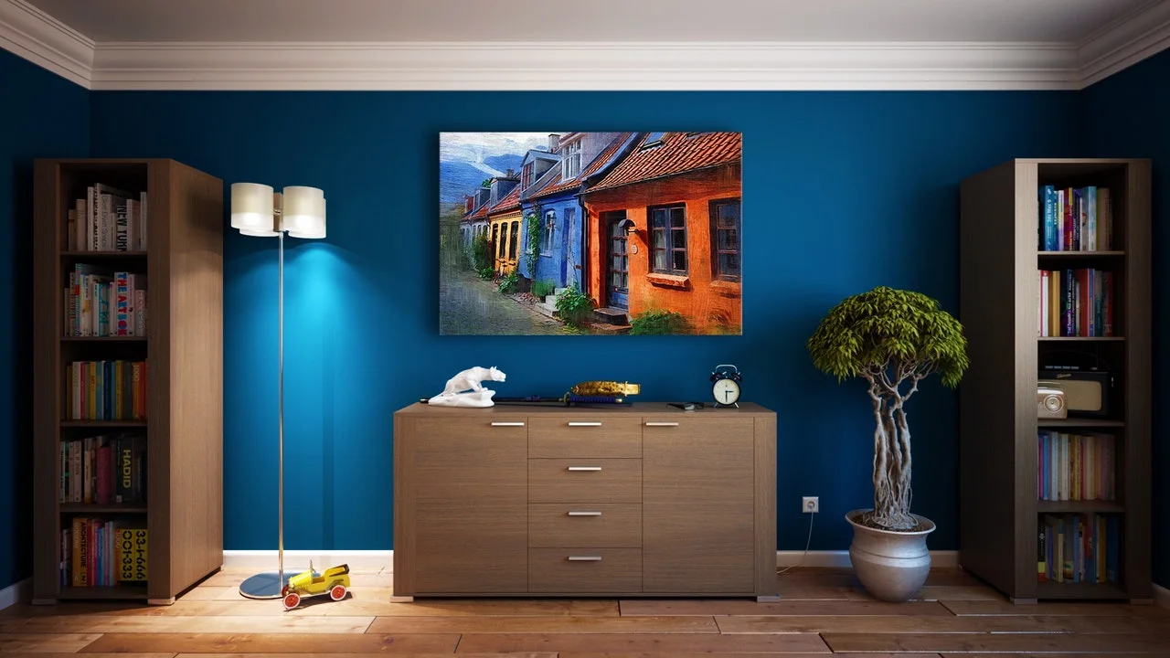
Secondly, consider your room's color palette. If your colors are on the warm side (yellows and reds), use cool white or warm white to enhance. Conversely, use daylight for rooms on the cool side of the color spectrum (that means more on the blues, greens and violets).
The good news is there are new lights too that switches colors from daylight to warm white all in one bulb.
Mistake #3: Brands
Third, don't mix color brands in the same room. Even if both brands indicate warm white, this doesn't necessarily mean that they are the same color temperature. Yes, I've been there. You will notice also a color difference between newly purchased lights and older lights. That's just the way it is.

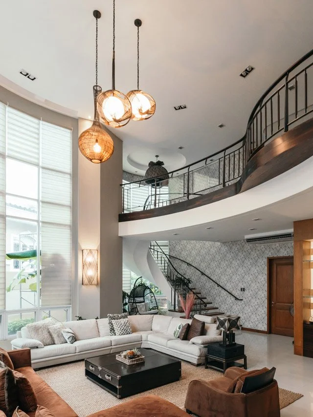
Mistake #4: Style of your Lighting
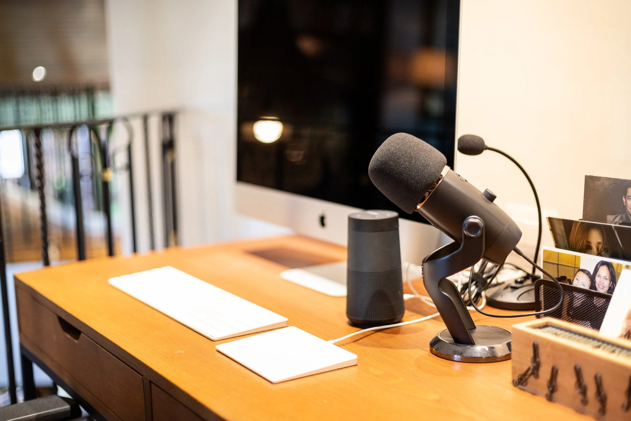
Whether you're buying a downlight, pendant light, floor lamp or task lamp, do remember to consider your room's design style. For a more pleasing outcome, match your choice of lighting. Yes, I did make this mistake in one area of my home. I loved this industrial style of pendant lights and used it in my open kitchen. My dining room in the meantime has a crystal chandelier. Yikes! Design mistakes are easy to make if you are uninformed. I have yet to correct this but I'm consistently haunted by it!
Correct these lighting mistakes now and make your home a better place to live. Join my weekly newsletter so you won't miss any of my tips and tricks! Link at the bottom of this page.